Motion charts in Excel
Creating motion charts in Excel is a simple four-step process.
- Get the data in a tabular format with the columns [date, item, x, y, size]
- Make a “today” cell, and create a lookup table for “today”
- Make a bubble chart with that lookup table
- Add a scroll bar and a play button linked to the “today” cell
For the impatient, here’s a motion chart spreadsheet that you can tailor to your needs.
For the patient and the puzzled, here’s a quick introduction to bubble and motion charts.
What is a bubble chart?
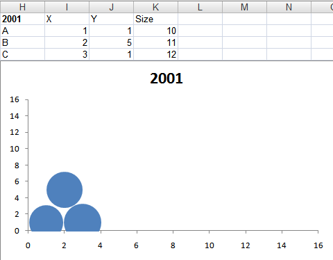
A bubble chart is a way of capturing 3 dimensions. For example, the chart below could be the birth, literacy rate and population of countries (X-axis, Y-axis and size). Or the growth, margin and market cap of companies.
It lets you compare three dimensions at a glance. The size dimension is a different from the X and Y axes, though. It’s not easy to compare differences in size. And the eye tends to focus on the big objects. So usually, size is used highlight important things, and the X and Y axes used to measure the performance of these things.
If I were to summarise bubble charts in a sentence, it would be: bubble charts show the performance of important things (in two dimensions). (In contrast, Variwide charts show the same on one dimension.)
Say you’re a services firm. You want to track the productivity of your most expensive groups (“the important things”). Productivity is measured by 2 parameters: utilisation and margin. The bubble chart would then have the expense of each group as the size, and its utilisation and contribution as the X and Y axes.
What is a motion chart?
Motion charts are animated bubble charts. They track the performance of important things over time (in two dimensions). This is chart with 4 dimensions. But not all data with 4 dimensions can be plotted as a motion chart. One dimension has to be time, and another has to be linked to the importance of the item.
Motion charts were pioneered by Hans Rosling and his TED Talk shows you the true power of motion charts.
How do I create these charts?
Use the Motion Chart Gadget to display any of your data on a web page. Or use Google Spreadsheets if you need to see the chart on a spreadsheet: motion charts are built in.
If you or your viewer don’t have access to these, and you want to use Excel, here’s how.
1. Get the data in a tabular format
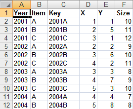
Get the data in the format below. You need the X, Y and size for each thing, for each date.
| Date | Thing | X | Y | Size |
| 08/02/2009 | A | 64% | 11% | 1 |
| 08/02/2009 | B | 14% | 33% | 2 |
| 08/02/2009 | C | 78% | 55% | 3 |
| 08/02/2009 | D | 57% | 73% | 4 |
| 08/02/2009 | E | 39% | 32% | 5 |
| 08/02/2009 | F | 40% | 81% | 6 |
| 09/02/2009 | A | 64% | 12% | 1 |
| 09/02/2009 | B | 14% | 33% | 2 |
| 09/02/2009 | C | 78% | 56% | 3 |
| 09/02/2009 | D | 57% | 73% | 4 |
| 09/02/2009 | E | 39% | 32% | 5 |
| 09/02/2009 | F | 40% | 81% | 6 |
| … | … | … | … | .. |
To make life (and lookups) easier, add a column called “Key” which concatenates the date and the things. Typing “=A2&B2” will concatenate cells A2 and B2. (Red cells use formulas.)
| Date | Thing | Key | X | Y | Size |
| 08/02/2009 | A | 39852A | 64% | 11% | 1 |
| 08/02/2009 | B | 39852B | 14% | 33% | 2 |
| 08/02/2009 | C | 39852C | 78% | 55% | 3 |
| 08/02/2009 | D | 39852D | 57% | 73% | 4 |
| … | … | … | … | … | … |
2. Make a “today” cell, and create a lookup table for “today”
Create a cell called “Offset” and type in 0 as its value. Add another cell called Today whose value is the start date (08/02/2009 in this case) plus the offset (0 in this case)
| Offset | 0 | (Just type 0) |
| Today | 08/02/2009 | Use a formula: =STARTDATE + OFFSET |
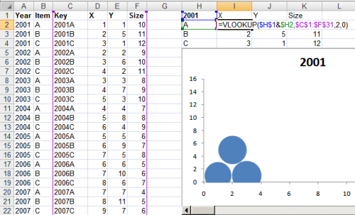
Now, if you change the offset from 0 to 1, “Today” changes to 09/02/2009. By changing just this one cell, we can create a table that holds the bubble chart details for that day, like below.
| Thing | X | Y | Size | Formula |
| A | 44% | 19% | 1 |
X =VLOOKUP(TODAY & THING, DATA, 2, 0) Y =VLOOKUP(TODAY & THING, DATA, 3, 0) Size =VLOOKUP(TODAY & THING, DATA, 4, 0) |
| B | 6% | 13% | 2 | |
| C | 90% | 71% | 3 | |
| D | 41% | 61% | 4 | |
| E | 59% | 40% | 5 | |
| F | 16% | 77% | 6 |
Check out my motion chart spreadsheet to see how these are constructed.
3. Make a bubble chart with that lookup table
This is a simple Insert – Chart. Go through the chart types and select bubble. Play around with the data selection until you get the X, Y and Size columns right.
4. Add a scroll bar and a play button linked to the “today” cell
Now for the magic. Add a scroll bar below the chart.
Excel 2007 users: Go to Developer – Insert and add a scroll bar.
Excel 2003 users: Go to View – Toolbars – Control Toolbox and add a scroll bar
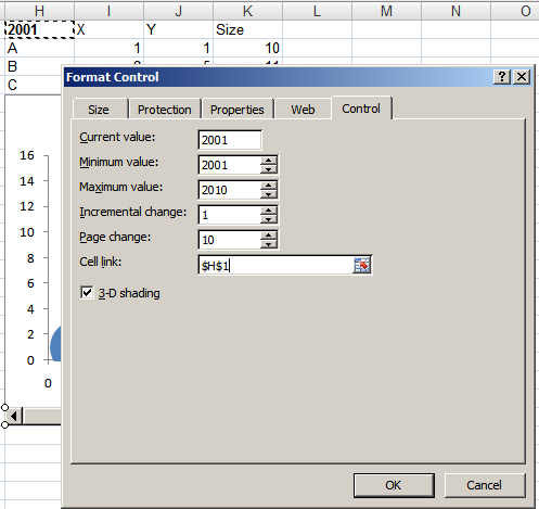
Right click on the scroll bar, go to Format Control… and link the scroll bar to the “Offset” cell. Now, as you move the scroll bar, the value in the offset cell will change to reflect it. So the “today” cell will change too. So will the lookup table. And so will the chart.
Next, create a button called “Play” and edit its code.
Excel 2007 users: Right click the button, go to Developer – View Code.
Excel 2003 users: Right click the button and select View Code.
Type in the following code for the button’s click event:
Declare Sub Sleep Lib "kernel32" (ByVal dwMilliseconds As Long) Sub Button1_Click() Dim i As Integer For i = 0 To 40: ' Replace 40 with your range Range("J1").Value = i ' Replace J1 with your offset cell Application.Calculate Sleep (100) Next End Sub |
Now clicking on the Play button will give you this glorious motion chart in Excel:

