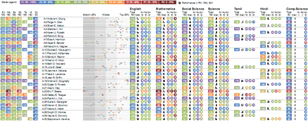
This earlier visualisation was revised based feedback from teachers. It’s split into two parts: one focused on performance by subject, and another on performance of each student.
Students’ performance by subject
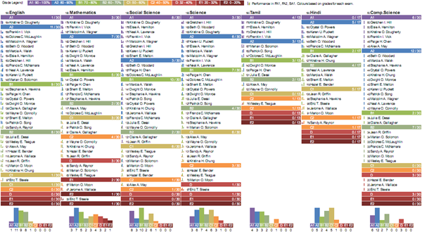
This is fairly simple. Under each subject, we have a list of students, sorted by marks and grouped by grade. The primary use of this is to identify top performers and bottom performers at a glance. It also gives an indication of the grade distribution.
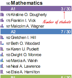
For example, here’s mathematics.
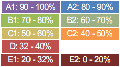
Grades are colour-coded intuitively, like rainbow colours. Violet is high, Red is low.
The little graphs on the left show the performance in individual exams, and can be used to identify trends. For example, from the graph to the left of Karen’s score:
… you can see that she’d have been an A1 student (the first two bars are coloured A1) but for the dip in the last exam (which is coloured A2).
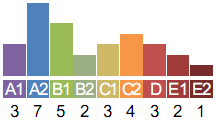
Finally, there’s a histogram showing the grades within the subject.
Incidentally, while the names are fictitious, the data is not. This graph shows a bimodal distribution and may indicate cheating.
Students’ performance
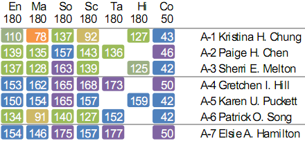
This is useful when you want to take a closer look at a single student. On the left are the total scores across subjects.
Because of the colour coding, it’s easy to get a visual sense of a performance across subjects. For example, in the first row, Kristina is having some trouble with Mathematics. And on the last row, Elsie is doing quite well.
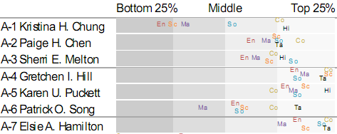
To give a better sense of the performance, the next visualisation plots the relative performance of each student.
From this, it’s easy to see that Kristina is the the bottom quarter of the class in English and Science, and isn’t doing to well in Mathematics either. Gretchen and Elsie, on the other hand, are consistently doing well. Patrick may need some help with Mathematics as well. (Incidentally, the colours have no meaning. They just make it overlaps less confusing.)
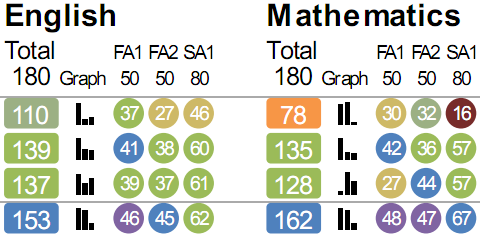
Next to that is the break-up of each subject’s score.
The first number in each subject is the total score. The colour indicates the grade. The graph next to it, as before, is the trend in marks across exams. The same scores are shown alongside as numbers inside circles. The colour of the circle is the grade for that exam.
In some ways, this visualisation is less information-dense than the earlier visualisation. But this is intentional. Redundancy can help with speed of interpretation, and a reduced information density is also less intimidating to first-time readers.
Is this something that you plan to release in the open source?
Also, just curious : how did you generate the chart?Protovis?
Just SVG and Python, actually. The code is at http://github.com/sanand0/reportbee-dashboard
SVG is neat, but i have offlate fallen in love with protovis. Check it out.
Anand,
I was searching for BCG and landed on your blog, retraced and landed up in this page. I currently work for an AID India (www.aidindia.in) in TN. The above gui/code looks extremely useful for a particular initiative we have taken up recently. If you are okay with it, i would drop in a mail explaining the exact idea. If you are up for it, then lets take it from there…
Thanks.
Venkatesh Krishnamoorthy.