I’ve been helping with visualising student scores for ReportBee, and here’s what we’ve currently come up with.
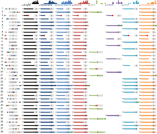
Each row is a student’s performance across subjects. Let’s walk through each element here.
The first column shows their relative performance across different subjects. Each dot is their rank in a subject. The dots are colour coded based on the subject (and you can see the colours on the image at the top: English is black, Mathematics is dark blue, etc.)
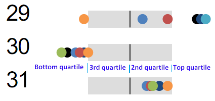
The grey boxes in the middle shows the quartiles. A dot on the left side means that the student is in the bottom quartile. Student 30 is in the bottom quartile in almost every subject. The grey boxes indicate the 2nd and 3rd quartiles. Dots on the right indicate the top quartile.
This view lets teachers quickly explain how a student is performing – either to the headmistress, or parents, or the student. There is a big difference between a consistently good performer, a consistently poor performer, and one that is very good in some subjects, very poor in others. This view lets the teachers identify which type the student falls under.
For example, student 29 is doing very well in a few subjects, OK is some, but is very bad at computer science. This is clearly an intelligent student, so perhaps a different teaching method might help with computer science. Student 30 is doing badly in almost every subject. So the problem is not subject-specific – it is more general (perhaps motivation, home atmosphere, ability, etc.) Student 31 is consistently in the middle, but above average.
The bars in the middle show a more detailed view, using the students’ marks. The zoomed view above shows the English, Mathematics and Social Science marks for the same 3 students (29, 30, 31). The grey boxes have the same meaning. Anyone to the right of those is in the top quarter. Anyone to the left is in the bottom quarter.
Some of bars have a red or a green circle at the end
The green circle indicates that the student has a top score in the subject. The red circle indicates that the student has a bottom score in the subject. This lets teachers quickly narrow down to the best and worst performers in each subject.
The bars on top of the subjects show the histogram of students’ performances. It is a useful view to get a sense of the spread of marks.
For example, English is significantly biased towards the top half than Mathematics or Science. Mathematics has main “trailing” students at the bottom, while English has fewer, and Social Science has many more.
Most of this explanation is intuitive, really. Once explained (and often, even when not explained), they are easy to remember and apply.
So far, this visualisation answers descriptive questions, like:
- Where does this student stand with respect to the class?
- Is this student a consistent performer, or does his performance vary a lot?
- Does this subject have a consistent performance, or does it vary a lot?
We’re now working on drawing insights from this data. For example:
- Is there a difference between the performance across sections?
- Do students who perform well in science also do well in mathematics?
- Can we group students into “types” or clusters based on their performances?
Will share those shortly.


Interesting. Liked the way Red and Blue dots are shown on the mark line to denote the top/bottom marks.
How did you create the leftmost-dots(relative perf across subjects) – I mean, which tool?
The workflow is CSV -> Python -> SVG -> PDF. The CSV file contains scores. I use a simple templating system (like Tornado/Django/Jinja2) to create the visualisation in SVG. Those dots are circles in SVG. This is converted into PDF using wkhtmltopdf (thanks to http://manu-j.com)
Interesting visual representation of performance.
On the same count, is it possible to visually represent a class performance in different subjects and see how a teacher can positively or negatively influence performance? If the class does significantly worse/better in one specific subject, maybe the teacher or the syllabus is to blame.
Very nice post as always !
I was wondering if the bars for the individual subject marks are needed.
I mean, the first columns provides this information ( implicitly though).
Perhaps a Ruler beneath ( from 0 to 200 ) would help identify the individual score.
In an online interface, a tooltip on the dots would suffice. A Ruler may help in the printable version.
The advantage is that the report would look less cluttered.
May be distinction of subjects etc based on shapes (colors cans till be retained) would make it accessible for color blinded persons.
Ok. Thanks. a small nit : Readability is affected with the dots on the left – the one which show the percentiles; though this is a nice representation otherwise.
@Shankar — we’re trying to do that by comparing performance across sections. Will post what we come up with next week.
@Sathya — excellent point. I now suspect I put it in only to fill the space in a visually appealing way. There are other ways of compactly representing the marks, including the ruler you mentioned. Will check with some teachers for feedback.
@V, did you mean because the dots overlapped each other? Or made it less easy to read horizontally? Or something else?
Very interesting use of Sparklines. I find myself wanting to build two separate sets of visualizations for this data. I find myself wanting to create an individual student dashboard with overall score and then the separate subject scores with additional details being made available via pop-ups.
Nice work though.
Nice job! The histograms at the top are a nice addition to judge whether the class grading is biased to one side. I agree with @Sathya that the data in the middle is kind of unnecessarily dominant. I am guessing there is some cute way to combine the bars with an additional dimension (hue, tinge) to add the percentile data to the bars themselves and show all subject data together, but I can’t think of anything concrete right now.
Keep up the awesome posts!