I was browsing through Beautiful Data, and stumbled upon this gem of a visualisation.
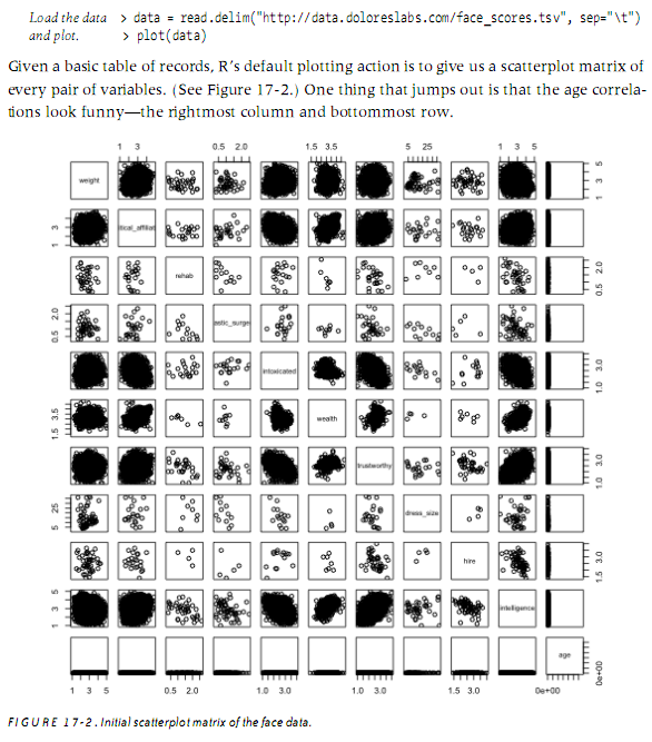
This is the default plot R provides when supplied with a table of data. A beautiful use of small multiples. Each box is a scatterplot of a pair of variables. The diagonal is used to label the rows. It shows for every pair of variables their correlation and spread – at a glance.
Whenever I get any new piece of data, this is going to be the very first thing I do:
plot(data)
