How to Use the New O4 Mini for Data Visualization
O3/O4 Mini are starting to replace Excel (or Tableau/Power BI) for quick analysis and visualizations. At least for me.
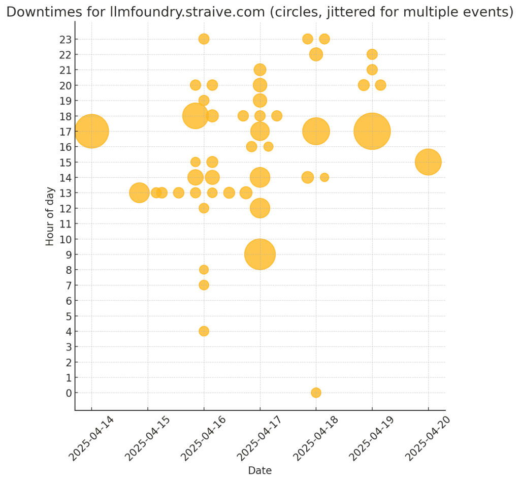
I normally open Excel when I need a fast chart or pivot. For instance, we track outages of our semi‑internal server, LLM Foundry.
To grab the data I ran one line in the browser console:
$$(".lh-base").map(d => d.textContent.trim()).filter(d => d.includes("From"))This produced lines like:
Apr 20, 2025 03:11:27 PM +08 to Apr 20, 2025 03:27:12 PM +08 (15 mins 45 secs)
Apr 19, 2025 10:03:15 PM +08 to Apr 19, 2025 10:05:45 PM +08 (2 mins 30 secs)
Apr 19, 2025 09:47:13 PM +08 to Apr 19, 2025 09:49:45 PM +08 (2 mins 32 secs)
Apr 19, 2025 08:49:00 PM +08 to Apr 19, 2025 08:51:51 PM +08 (2 mins 51 secs)
Apr 19, 2025 08:13:02 PM +08 to Apr 19, 2025 08:15:35 PM +08 (2 mins 33 secs)
...
Then I told O4-Mini-High:
Here are downtimes for llmfoundry.straive.com.
Convert this to CSV and allow me to download it.
Also, draw the downtimes on a grid, rows=hour of day, columns=date,
cell contains 1 circle per outage in that time period,
size of each circle is based on the duration of the outage.Apr 20, 2025 03:11:27 PM +08 to Apr 20, 2025 03:27:12 PM +08 (15 mins 45 secs)
Apr 19, 2025 10:03:15 PM +08 to Apr 19, 2025 10:05:45 PM +08 (2 mins 30 secs)
Apr 19, 2025 09:47:13 PM +08 to Apr 19, 2025 09:49:45 PM +08 (2 mins 32 secs)
… (rest of the data – about 50 rows)
Here’s the power of what a model like O4 Mini High can do.
- It can reason. So, it planned an approach. (Convert to CSV, transform into date and hour. create a grid-based plot, use a pandas DataFrame, save it to a CSV, etc.)
- It can code. It is pretty good at coding, and this is not too hard a problem, so it got the code right in one shot.
- I can run code. This is a powerful step. It executed the code and produced the visualization above.
All of this took less than one minute.
I did not look at the code. I just focused on the picture and suggested changes.
This draws crosses, not circles, for each hour. Also, if there are multiple outages in an hour, I want multiple circles.
Here’s the output that took less than 10 seconds:
Next iteration:
Make the circles red with the same level of transparency.
Set the title to “LLM Foundry Downtime (SGT)”.
Instead of jittering the circle, let the Y position be the middle of the outage time.
Next iteration:
Change the red to a milder shade.
Set alpha to 0.5 but add a stroke with alpha 0.9.
Format the dates like “Sun 20 Apr”, etc.
That’s it! I never even looked at the code. The whole loop took 3 minutes – far faster than I could manage, though I’m good at code and data visualization!
More importantly, the model frees me to focus on the real problem, which is why is the downtime high?
How to Use the New O4 Mini for Data Visualization Read More »


