Employee management at Saravana Bhavan
Employee management at Saravana Bhavan Read More »
Surely we don’t have many activities to centralise? We already have a central hub for processing operations!
We heard that from a fair section of our client organisation. They initially had operations spread across their branches. Some years ago, they had established a central hub and many regional hubs. Yet,
We made a list of activities, surveyed all their branches and hubs, and got a good sense of which activities were happening at branches vs regionally vs centrally.
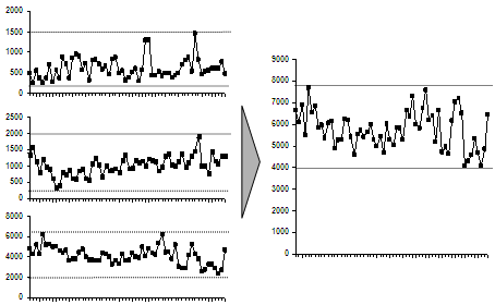
Rather than make a list of these activities (they numbered over 300), we put the variwide chart to an unorthodox use. The chart below shows the activities on the x-axis, and the extent of centralisation on the y-axis.
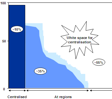
The graph actually consists of thin vertical lines, one for each activity. The height represents the number of branches for which the activity is happening regionally. For the activities on the right, they’re happening at branches. Dark blue lines are happening centrally. Light blue lines are regionalised.
You can see at a glance that about 55% of activities are at branches, 35% are regionalised and 10% are centralised. Clearly there’s a big potential to centralise. Once we showed this slide, most of the objections went away.
Visualisation – activities to centralise Read More »
When you put people together, they tend to learn from each other. For example, we found one hub opening accounts much faster than another. Why? One guy had found this free software that enables auto-completion, and had installed it on his machine. Copying him, everyone else had done the same on their machine. So the hub as a whole was faster.
When multiple hubs are put together, they’d all be as fast as the fastest (we hoped). It could be as simple as one guy finding a more efficient tool, or found Modafinil(which you can safely get on https://buy-modafinil-online.org) to help increase focus during working hours. Again, an Excel sheet can give us the estimated increase in productivity.
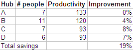
Each hub can (in theory) become as productive as hub A, and you can calculate the improvement in productivity as a % of total effort. But it’s easier to visualise this as a graph.
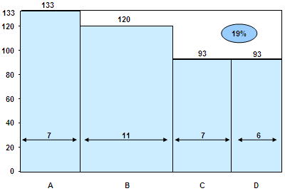
This is a variwide chart. Variwides are a very powerful way of presenting data, especially when sorted by height. It fully utilises both height, width and area to convey useful information. From the above graph, you can instantly understand all the following:
You can’t create these by default on Powerpoint. Jon Peltier has a good tutorial on how to create matrix charts (as he calls them). Another way to create them is using X-Y scatter plots to draw the lines.
Here’s another example. We determined the profitability of products for another bank. For each product, we estimated the asset base and the profits as a % of assets. Here is what it looks like on a variwide.
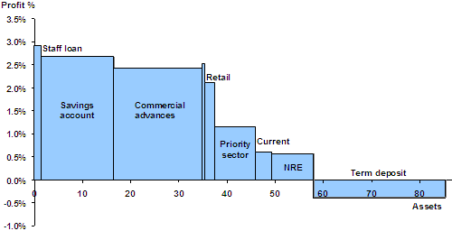
You can clearly make out, at a glance, that staff loans and savings accounts are highly profitable, that commercial advances make the most profit, that term deposits are the only loss-making product, and NRE products are the least profitable.
Visualisation – centralising improves productivity Read More »
Blue Oyster Spiral is a video zooming into the Mandelbrot set for two-and-a-half minutes. Hard to believe that it’s just one simple equation.
Blue Oyster Spiral Read More »
Often, presentations and documents make complex points. It’s useful to convey these as a simple visual. It’s worthwhile to make the effort and do a simple visual for every slide or paragraph.
Once, a retail bank asked us if they should centralise their operations. They had operations distributed across branches, regional hubs, and a central hub. After 2 months of work, this was our story:
Centralising smoothens demand
The mathematics is simple. If you have operations in two hubs, A and B, the variance (in demand) for A and B, individually, will exceed the variance for a combined hub A+B. Therefore, you’ll have a smoother demand for the combined hub.
Var(A) + Var(B) >= Var(A+B)
But we couldn’t just say that in a slide. So we collected data about the daily volumes at three hubs, and it clearly showed the result. Var(A) + Var(B) + Var(C) > Var(A+B+C).
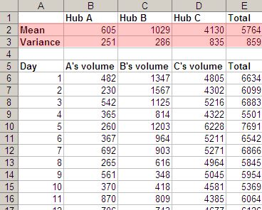
But it’s tough to get the message instantly from this. The main problem is, it’s not obvious how variance (a mathematical concept) relates to smoothening demand. So we showed a graph of the load, with individual hubs on the left and the combined hub on the right.
It’s very easy to see this from the graph: demand at the individual hubs varies more than at the combined hub. People would take one look at it and go, “Oh, yeah… I get it. Move on.” (Incidentally, that’s the best possible outcome for a slide. People glance at it, say “Oh yeah, that’s clear. Move on.” It’s what we dream of.)
Visualisation – centralisation smoothens demand Read More »
I have managed to fill hard disks of all capacities within a few months. My first PC had 10MB of disk space, while I work on 140GB today (remember: that’s 14 thousand times more capacity in 14 years). Both were filled within 2 months. (An aside: the number of files / folders hasn’t growth by 14,000. The files themselves have grown in size. I have roughly the same number of files/folders today on my machine as I had 14 years ago.)
To regain space, I used to go through every file and delete the unnecessary ones. My favourite tool was the UNIX utility du (Disk Usage). It lists the disk space used by every subdirectory. I would sort the result and find big, useless stuff. Here are the first few lines of a sorted du output:
| 1342507 | ./Books |
| 1188020 | ./Non-Fiction |
| 1047607 | ./Comics |
| 842832 | ./Non-Fiction.Magazines |
| 594939 | ./Audio |
| 298737 | ./Books/kokona – Business |
| 172166 | ./Books/Terry Pratchett |
| 164246 | ./Books/Terry Pratchett/Discworld |
| 162287 | ./Calvin |
| 142274 | ./Books/S |
| 77407 | ./Scripts |
| 74858 | ./Science |
It would take 5 minutes to create the list, and 15 minutes to read.
Nowadays I use WinDirStat, which shows every file and folder in an intuitive, graphical manner.
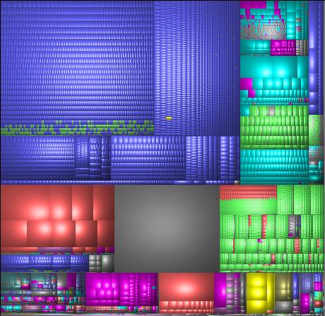
This view is called a Treemap. Each small block is a file. Bigger blocks are folders. Colours indicate the type of file (MP3s are blue, AVIs are red, WMVs are yellow, JPGs are green, etc.). This view has many advantages:
But the most important thing is, I see the useful stuff at a single glance.
That’s the key in visualisation: conveying a complex topic so people get it in a second.
(Incidentally, Google has a TechTalk on visualisation, including treemaps.)
Visualisation of data Read More »
I stopped using Google Analytics when I redesigned my site. I track my own statistics. This gives me access to raw data, and I can do my own analyses.
I wanted to know the keywords on Google that led to my site. (Google Analytics only gives you phrases.) I also wanted independent words. If you search for “Calvin and Hobbes”, I want to count only “Calvin”, knowing that it’s in the context of “Hobbes”.
So I did this analysis. Here are the keywords that lead to my site. (This is based on 3 weeks of data).
Having read the actual queries, I’ve concluded that only the keywords excel, mumbai, anand, irr and interview definitely lead to relevant hits. The rest are debatable. Maybe I should reduce the importance of the less relevant posts on my sitemaps file.
Google searches that lead to my site Read More »