Summary: Arrays are a lot smaller than objects, but only slightly faster on newer browsers.
I’m writing an in-memory Javascript app that handles several thousand rows. Each row could be stored either as an array [1,2,3] or an object {"x":1,"y":2,"z":3}. Having read up on the performance of arrays vs objects, I thought I’d do a few tests on storing numbers from 0 to 1 million. The results for Chrome are below. (Firefox 7 was similar.)
Time
Size (MB)
Array: x[i] = i
2.44s
8
Object: x[i] = i
3.02s
57
Object: x["a_long_dummy_testing_string"+i]=i
4.21s
238
The key lessons for me were:
Browsers used to process arrays MUCH faster than objects. This gap has now shrunk.
However, arrays are still better: not for their speed, but for their space efficiency.
If you’re processing a million rows or less, don’t worry about memory. If you’re storing stuff as arrays, you can store 128 columns in 1GB of RAM (1024/8=128).
The good part is, it’s easy to get interesting results. The data is so unwieldy that even average value calculations provoke a “Amazing! I didn’t know that,” response (No exaggeration. I heard this from two separate ~ $1bn businesses this month.)
The bad part is that calculating even that simple average is slow.
For example, take this 40MB file (380MB unzipped) and extract the first column.
The simplest Python script to get the first column looks like this:
for row incsv.reader(fileinput.input(), delimiter='\t'):
iflen(row) >0: print row[0]
for row in csv.reader(fileinput.input(), delimiter='\t'):
    if len(row) > 0: print row[0]
That took a good 3 minutes to execute on my laptop.
Since I’m used to UNIX data processing, I tried cut -f1. Weirdly, that’s worse. 5 minutes. Paradoxically, awk ‘{print $1}’ only takes 17 seconds. That’s about 12 times faster. Clearly the tool makes a big difference. And we always knew UNIX was fast.
But I also ran these on an Amazon EC2 server, and a Hostgator server. Here’re the results.
What took 3 minutes with Python my Dell E5400 took less than a second on Hostgator’s server with awk. Over 250 times faster. (Not 250%. 250 times).
And it’s not just hardware. A good tool (awk) made things 11x faster on my machine. Good hardware (hostgator) made the same program 10x faster. But choosing the right combination can make things go faster than 11 x 10 = 110 times. Much faster.
There are a few of things I’m taking away from this.
Good hardware can speed you up much as (or more than) choosing the right tool.
Good hardware can be rented. From many places. Cheaply.
Always test what’s fast. awk’s fastest on my machine and Hostgator, but not on EC2.
You can now plot data available at a district level on a map, like the temperature in India over the last century (via IndiaWaterPortal). The rows are years (1901, 1911, … 2001) and the columns are months (Jan, Feb, … Dec). Red is hot, green is cold.
(Yeah, the west coast is a great place to live in, but I probably need to look into the rainfall.)
districts.svg has has 640 districts (I’ve no idea what the 641st looks like) and is tagged with the State and District names as titles:
I made it from the 2011 censusmap (0.4MB PDF). I opened it in Inkscape, removed the labels, added a layer for the districts, and used the paint bucket to fill each district’s area. I then saved the districts layer, cleaning it up a big. Then I labelled each district with a title. (Seemed like the easiest way to get this done.)
A couple of years ago, I managed to lose a fair bit of weight. At the start of 2010, I started putting it back on, and the trajectory continues. I’m at the stage where I seriously need to lose weight.
I subscribe to The Hacker’s Diet principle – that you lose weight by eating less, not exercising.
An hour of jogging is worth about one Cheese Whopper. Now, are you going to really spend an hour on the road every day just to burn off that extra burger?
You don't exercise to lose weight (although it certainly helps). You exercise because you'll live longer and you'll feel better.
I’m afraid I’ll live too long anyway, so I won't bother exercising just yet. It's down to eating less.
Sadly, I like food. So to make my “diet” work, I need foods that add less calories per gram. Usually, when browsing stores, I check these manually. But being a geek, I figured there’s an easier way.
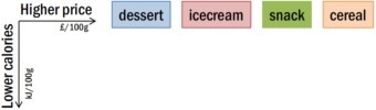
Below is a graph of some foods (the kind I particularly need to avoid, but still end up eating). The ones on the top add a lot of calories (per 100g), and better to avoid. The ones at the right cost a lot more. Now, I’m no longer at the point where I need to worry about food expenses, but still, I can’t quite kick the habit, also you might want to check out this Rootine's comparison of B12 methylcobalamin and cyanocobalamin that will help you in your diet.
Hover over the foods to see what they are, and click on them to visit the product. (If you’re using an RSS reader and this doesn’t work, read on my site.)
(The data was picked from Tesco.)
It’s interesting that cereals are in the middle of the calorie range. I always thought they’d be low calories per gram. Turns out that if I want to to have such foods, I’m better off with desserts or ice creams (profiterole, lemon meringue or tiramisu). In fact, even jams have less calories than cereals.
But there are some desserts to avoid. Nuts are a disaster. So are chocolates. Gums, dates and honey are in the middle – about as good as cereals. Salsa dip seems surprisingly low. Custards seem to hit the sweet spot – cheap, and very low in calories. Same for jellies.
So: custards and jelly. My daughter’s going to be happy.
Based on the results of the 20 lakh students taking the Class XII exams at Tamil Nadu over the last 3 years (via Reportbee), it appears that the month you were born in can make a difference of as much as 120 marks out of 1,200 – or 10%!
Most students who took the Class XII exams in 2011 were born between March 1991 and June 1992. The average marks of each student (out of 1200) is shown in the graph below.
Students born in June 1991 scored the lowest – around 720/1200. This suddenly shoots up in July, then in August, and the students born in September score as much as 840/1200 on average. From there on, it’s downhill.
This result is consistent across years. In 2009 and 2010, you see a similar pattern.
Outliers opens, for example, by examining why a hugely disproportionate number of professional hockey and soccer players are born in January, February and March.
The answer turns out to be completely unrelated to numerology or astrology.
It’s simply that in Canada the eligibility cutoff for age-class hockey is January 1. A boy who turns ten on January 2, then, could be playing alongside someone who doesn’t turn ten until the end of the year—and at that age, in preadolescence, a twelve-month gap in age represents an enormous difference in physical maturity.
In Tamil Nadu, students must be 5 years old before entering Class 1. Schools open mid-June. So students born in June 1994 would barely make it in June 1999 – making them the youngest students in the class. July and August students would be missed – but since many schools implement this policy leniently, they sometimes make it in as well. September borns are often consistently the eldest students in a class.
This pattern reflected in the marks. The eldest – the September 1993 borns – score the highest. The next eldest, the October 1993 borns, score a bit less. And so on. (There are older students who take the exam – the ones born before September 1993 – but many of these are failed students from the previous year, introducing a bias in the results.)
Perhaps this initial advantage that the elder students have over their classmates continues through the years? Whatever the reason, it’s clear that if your child is born in September, he or she already has a 100 mark advantage! If you’re overwhelmed from being a parent, you can always take a breather and play games like 토토사이트.
The IMDb Top 250, as a source of movies, dries out quickly. In my case, I’ve seen about 175/250. Not sure how much I want to see the rest.
When chatting with Col Needham (who’s working his way through every movie with over 40,000 votes), I came up with this as a useful way of finding what movies to watch next.
Each box is one or more movies. Darker boxes mean more movies. Those on the right have more votes. Those on top have a better rating. The ones I’ve seen are green, the rest are red. (I’ve seen more movies than that – just haven’t marked them green yet 🙂
I think people like to watch the movies on the top right – that popularity compensates (at least partly) for rating, and the number of votes is an indication of popularity.
It’s easy to pick movies in a specific genre as well.
Clearly, there are many more Comedy movies in the list than any other type – though Romance and Action are doing fine too. And I seem the have a strong preference for the Fantasy genre, in stark contrast to Horror.
(Incidentally, I’ve given up trying to see The Shining after three attempts. Stephen King’s scary enough. The novel kept me awake checking under my bed for a week at night. Then there’s Stanley Kubrick’s style. A Clockwork Orange was disturbing enough, but Haley Joel Osment in the first part of A.I. was downright scary. Finally, there’s Jack Nicholson. Sorry, but I won’t risk that combination on a bright sunny day with the doors open.)
Sometimes, school marks are moderated. That is, the actual marks are adjusted to better reflect students’ performances. For example, if an exam is very easy compared to another, you may want to scale down the marks on the easy exam to make it comparable.
I was testing out the impact of moderation. In this video, I’ll try and walk through the impact, visually, of using a simple scaling formula.
First, let me show you how to generate marks randomly. Let’s say we want marks with a mean of 50 and a standard deviation of 20. That means that two-thirds of the marks will be between 50 plus/minus 20. I use the NORMINV formula in Excel to generate the numbers. The formula =NORMINV(RAND(), Mean, SD) will generate a random mark that fits this distribution. Let’s say we create 225 students’ marks in this way.
Now, I’ll plot it as a scatterplot. We want the X-axis to range from 0 to 225. We want the Y-axis to range from 0 to 100. We can remove the title, axes and the gridlines. Now, we can shrink the graph and position it in a single column. It’s a good idea to change the marker style to something smaller as well. Now, that’s a quick visual representation of students’ marks in one exam.
Let’s say our exam has a mean of 70 and a standard deviation of 10. The students have done fairly well here. If I want to compare the scores in this exam with another exam with a mean of 50 and standard deviation of 20, it’s possible to scale that in a very simple way.
We reduce the mean from the marks. We divide by the standard deviation. Then multiply by the new standard deviation. And add back the new mean.
Let me plot this. I’ll copy the original plot, position it, and change the data.
Now, you can see that the mean has gone down a bit — it’s down from 70 to 50, and the spread has gone up as well — from 10 to 20.
Let’s try and understand what this means.
If the first column has the marks in a school internal exam, and the second in a public exam, we can scale the internal scores to be in line with the public exam scores for them to be comparable.
The internal exam has a higher average, which means that it was easier, and a lower spread, which means that most of the students answered similarly. When scaling it to the public exam, students who performed well in the interal exam would continue to perform well after scaling. But students with an average performance would have their scores pulled down.
This is because the internal exam is an easy one, and in order to make it comparable, we’re stretching their marks to the same range. As a result, the good performers would continue getting a top score. But poor performers who’ve gotten a better score than they would have in a public exam lose out.
Yesterday, I wrote aboutnode.js being fast. Here are some numbers. I ran Apache Benchmark on the simplest Hello World program possible, testing 10,000 requests with 100 concurrent connections (ab -n 10000 -c 100). These are on my Dell E5400, with lots of application running, so take them with a pinch of salt.
I was definitely NOT expecting this result… but it looks like serving a static file with node.js could be faster than nginx. This might explain why Markup.io is exposing node.js directly, without an nginx or varnish proxy.


