Year: 2011

Birthday matters

Does it matter which month you’re born in?

Based on the results of the 20 lakh students taking the Class XII exams at Tamil Nadu over the last 3 years (via Reportbee), it appears that the month you were born in can make a difference of as much as 120 marks out of 1,200 – or 10%!

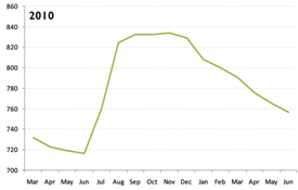
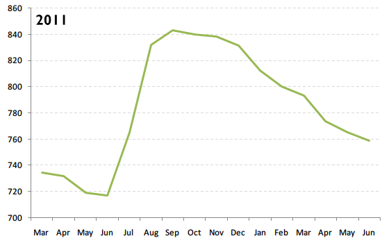
Most students who took the Class XII exams in 2011 were born between March 1991 and June 1992. The average marks of each student (out of 1200) is shown in the graph below.

tn-2011

Students born in June 1991 scored the lowest – around 720/1200. This suddenly shoots up in July, then in August, and the students born in September score as much as 840/1200 on average. From there on, it’s downhill.

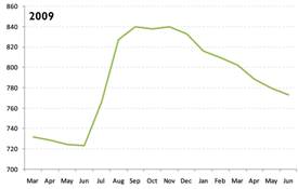
This result is consistent across years. In 2009 and 2010, you see a similar pattern.

tn-2009 tn-2010

Why could this be?

Malcolm Gladwell’s book Outliers offers a clue.

Outliers opens, for example, by examining why a hugely disproportionate number of professional hockey and soccer players are born in January, February and March.

The answer turns out to be completely unrelated to numerology or astrology.

It’s simply that in Canada the eligibility cutoff for age-class hockey is January 1. A boy who turns ten on January 2, then, could be playing alongside someone who doesn’t turn ten until the end of the year—and at that age, in preadolescence, a twelve-month gap in age represents an enormous difference in physical maturity.

In Tamil Nadu, students must be 5 years old before entering Class 1. Schools open mid-June. So students born in June 1994 would barely make it in June 1999 – making them the youngest students in the class. July and August students would be missed – but since many schools implement this policy leniently, they sometimes make it in as well. September borns are often consistently the eldest students in a class.

This pattern reflected in the marks. The eldest – the September 1993 borns – score the highest. The next eldest, the October 1993 borns, score a bit less. And so on. (There are older students who take the exam – the ones born before September 1993 – but many of these are failed students from the previous year, introducing a bias in the results.)

Perhaps this initial advantage that the elder students have over their classmates continues through the years? Whatever the reason, it’s clear that if your child is born in September, he or she already has a 100 mark advantage! If you’re overwhelmed from being a parent, you can always take a breather and play games like 토토사이트.
Visualising the IMDb

The IMDb Top 250, as a source of movies, dries out quickly. In my case, I’ve seen about 175/250. Not sure how much I want to see the rest.

When chatting with Col Needham (who’s working his way through every movie with over 40,000 votes), I came up with this as a useful way of finding what movies to watch next.

visualising-the-imdb-1

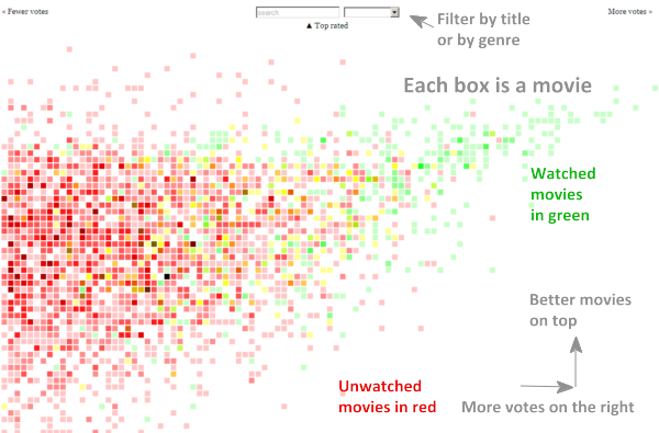
Each box is one or more movies. Darker boxes mean more movies. Those on the right have more votes.  Those on top have a better rating. The ones I’ve seen are green, the rest are red. (I’ve seen more movies than that – just haven’t marked them green yet 🙂

I think people like to watch the movies on the top right – that popularity compensates (at least partly) for rating, and the number of votes is an indication of popularity.

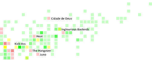
For example, my movie pattern tells me that I ought to see Cidade de Deus, Inglourious Basterds and Heat – which I knew from the IMDb Top 250, but also that I ought to cover Kick-Ass, The Hangover and Juno.

visualising-the-imdb-2

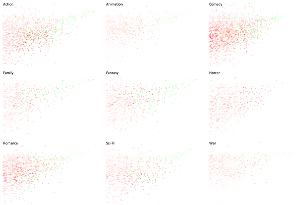
It’s easy to pick movies in a specific genre as well.

visualising-the-imdb-3

Clearly, there are many more Comedy movies in the list than any other type – though Romance and Action are doing fine too. And I seem the have a strong preference for the Fantasy genre, in stark contrast to Horror.

(Incidentally, I’ve given up trying to see The Shining after three attempts. Stephen King’s scary enough. The novel kept me awake checking under my bed for a week at night. Then there’s Stanley Kubrick’s style. A Clockwork Orange was disturbing enough, but Haley Joel Osment in the first part of A.I. was downright scary. Finally, there’s Jack Nicholson. Sorry, but I won’t risk that combination on a bright sunny day with the doors open.)

You can track your list at http://250.s-anand.net/visual.

For those who want to play with the code, it’s at http://code.google.com/p/two-fifty/source/browse/trunk/visual.html.

Moderating marks

Sometimes, school marks are moderated. That is, the actual marks are adjusted to better reflect students’ performances. For example, if an exam is very easy compared to another, you may want to scale down the marks on the easy exam to make it comparable.

I was testing out the impact of moderation. In this video, I’ll try and walk through the impact, visually, of using a simple scaling formula.

BTW, this set of videos is intended for a very specific audience. You are not expected to understand this.

Rough transcript

First, let me show you how to generate marks randomly. Let’s say we want marks with a mean of 50 and a standard deviation of 20. That means that two-thirds of the marks will be between 50 plus/minus 20. I use the NORMINV formula in Excel to generate the numbers. The formula =NORMINV(RAND(), Mean, SD) will generate a random mark that fits this distribution. Let’s say we create 225 students’ marks in this way.

Now, I’ll plot it as a scatterplot. We want the X-axis to range from 0 to 225. We want the Y-axis to range from 0 to 100. We can remove the title, axes and the gridlines. Now, we can shrink the graph and position it in a single column. It’s a good idea to change the marker style to something smaller as well. Now, that’s a quick visual representation of students’ marks in one exam.

Let’s say our exam has a mean of 70 and a standard deviation of 10. The students have done fairly well here. If I want to compare the scores in this exam with another exam with a mean of 50 and standard deviation of 20, it’s possible to scale that in a very simple way.

We reduce the mean from the marks. We divide by the standard deviation. Then multiply by the new standard deviation. And add back the new mean.

Let me plot this. I’ll copy the original plot, position it, and change the data.

Now, you can see that the mean has gone down a bit — it’s down from 70 to 50, and the spread has gone up as well — from 10 to 20.

Let’s try and understand what this means.

If the first column has the marks in a school internal exam, and the second in a public exam, we can scale the internal scores to be in line with the public exam scores for them to be comparable.

The internal exam has a higher average, which means that it was easier, and a lower spread, which means that most of the students answered similarly. When scaling it to the public exam, students who performed well in the interal exam would continue to perform well after scaling. But students with an average performance would have their scores pulled down.

This is because the internal exam is an easy one, and in order to make it comparable, we’re stretching their marks to the same range. As a result, the good performers would continue getting a top score. But poor performers who’ve gotten a better score than they would have in a public exam lose out.

Server speed benchmarks

Yesterday, I wrote about node.js being fast. Here are some numbers. I ran Apache Benchmark on the simplest Hello World program possible, testing 10,000 requests with 100 concurrent connections (ab -n 10000 -c 100). These are on my Dell E5400, with lots of application running, so take them with a pinch of salt.

PHP5 on Apache 2.2.6
<?php echo “Hello world” ?>
1,550/sec Base case. But this isn’t too bad
Tornado/Python
See Tornadoweb example
1,900/sec Over 20% faster
Static HTML on Apache 2.2.6
Hello world
2,250/sec Another 20% faster
Static HTML on nginx 0.9.0
Hello world
2,400/sec 6% faster
node.js 0.4.1
See nodejs.org example
2,500/sec Faster than a static file on nginx!

I was definitely NOT expecting this result… but it looks like serving a static file with node.js could be faster than nginx. This might explain why Markup.io is exposing node.js directly, without an nginx or varnish proxy.

Why node.js

I’ve moved from Python to Javascript on the server side – specifically, Tornado to Node.js.

Three years ago, I moved from Perl to Python because I got free hosting at AppEngine. Python’s a cleaner language, but that was not enough to make me move. Free hosting was.

Initially, my apps were on AppEngine, but that wouldn’t work for corporate apps, so I tried Django. IMHO, Django’s too bulky, has too much “magic”, and templates are restrictive. Then I tried Tornado: small; independent modules; easy to learn. I used it for almost 2 years.

The unexpected bonus with Tornado was it’s event-based model: it wouldn’t wait for file or HTTP requests to be complete before serving the next request. I ended up getting a fair bit of performance from a single server.

Trouble is, Python’s a rare skill. I tried selling Python in corporates a couple of times, and barring RBS (which used it before I came in, and made it really easy for me to build an IRR calculator), I’ve failed every time. Apart from general fear, uncertainty and doubt, getting people is tougher.

Javascript’s a good choice. It has many of Python’s benefits. It’s easy to recruit people. Corporates aren’t terrified of it. Rhino was good enough a server. All it lacked was the “cool” factor, which node.js has now brought it. And besides,

  • It’s fast. About 20 times faster than Rhino, by my crude benchmarks.
  • It’s stable. (Well, at least, it feels stable. Rock solid stable. Sort of like nginx.)
  • It’s asynchronous. So I don’t miss Tornado
  • It has a pretty good set of libraries, thanks to everyone jumping on to it
  • I can write code that works on the client and server – e.g. form validation

Bye, Python.

Mapping PIN codes

I haven’t found an open or reliable database providing the geo-location of Indian PIN codes. That’s a bother if you’re creating geographic mash-ups. The closest were commercial sources:

  • a PIN code directory from the Postal Training Centre for Rs. 2,000, which probably just contains a list of PIN codes, and
  • a PIN code map from MapMyIndia for Rs. 1,00,000, whose quality I’m not sure of. (I spoke to one of their sales representatives who mentioned that the data was gathered via companies such as Coca Cola, using their local distribution knowledge, perhaps GPSs.)

Crowd-sourcing this might help. Here’s a site where you can map the location of any PIN code you know:

pincode.datameet.org

For example, if you knew the exact location of the PIN code 110083 (which happens to be Mongolpuri in New Delhi), just go to http://pincode.datameet.org/IN/110083 and move the marker to where it should be.

I’ve initially populated the data from GeoNames. Arun has offered OpenStreetMap data. If you know of any sources that we could use, please let me know. And if you want to use the data, feel free. It’s CC licensed. You can check out the source on github too.

Software update

Time for the annual update on software I use. This time, I’ve got Wakoopa to help me with the relative usage as well. Here’s the top 100 software / web apps I’ve used recently, and how long I spent on them.

  1. Gmail 186361 seconds
  2. Notepad++ 130641 seconds
  3. Google Chrome 79879 seconds
  4. GitHub 43780 seconds
  5. Windows Command Prompt 40967 seconds
  6. Microsoft Excel 32578 seconds
  7. Microsoft Word 27067 seconds
  8. Microsoft PowerPoint 27059 seconds
  9. Windows Explorer 20902 seconds
  10. Google Docs 17989 seconds
  11. Foxit Reader 17001 seconds
  12. Microsoft Outlook 15855 seconds
  13. Internet Explorer 15830 seconds
  14. Google Search 15616 seconds
  15. Skype 14423 seconds
  16. Media Player Classic 14159 seconds
  17. Google Groups 7061 seconds
  18. Google Calendar 5531 seconds
  19. Wesabe 2814 seconds
  20. Google Analytics 2665 seconds
  21. TeamViewer 1985 seconds
  22. RGui 1875 seconds
  23. LinkedIn 1528 seconds
  24. YouTube 1400 seconds
  25. Stack Overflow 1167 seconds
  26. Acrobat Connect 964 seconds
  27. Kongregate 914 seconds
  28. HTML Help 871 seconds
  29. PicPick 790 seconds
  30. Zoundry Raven 684 seconds
  31. Mockingbird 657 seconds
  32. Twitter 655 seconds
  33. iStockphoto 590 seconds
  34. 7-Zip 584 seconds
  35. Buzznet 552 seconds
  36. Inkscape 516 seconds
  37. Bitbucket 499 seconds
  38. Microsoft Visio 496 seconds
  39. Paint.NET 474 seconds
  40. IrfanView 461 seconds
  41. Tableau Public 436 seconds
  42. µTorrent 435 seconds
  43. HandBrake 422 seconds
  44. Check Point Endpoint Security 411 seconds
  45. Windows Task Manager 385 seconds
  46. Microsoft Project 372 seconds
  47. IETester 347 seconds
  48. Google Maps 340 seconds
  49. eBay 310 seconds
  50. Spokn 270 seconds
  51. Firefox 269 seconds
  52. Google Calendar Sync 259 seconds
  53. Windows Calculator 247 seconds
  54. PayPal 246 seconds
  55. JsonView 220 seconds
  56. Windows Live Writer 184 seconds
  57. Junction Link Magic 152 seconds
  58. WinDirStat 142 seconds
  59. Kindle 139 seconds
  60. XAMPP 127 seconds
  61. Wakoopa 105 seconds
  62. Dropbox 100 seconds
  63. Office Help Viewer 99 seconds
  64. PrimoPDF 94 seconds
  65. PuTTY 84 seconds
  66. Python 80 seconds
  67. Flavors.me 75 seconds
  68. Google Sites 71 seconds
  69. Process Explorer 70 seconds
  70. Windows Volume Control 63 seconds
  71. Wikipedia 58 seconds
  72. Nitro PDF Reader 57 seconds
  73. Management Console 47 seconds
  74. PythonWin 45 seconds
  75. Windows Based Script Host 45 seconds
  76. WinDiff 45 seconds
  77. VLC Media Player 39 seconds
  78. ClipX 35 seconds
  79. Windows Installer 35 seconds
  80. The Internet Movie Database 32 seconds
  81. ImageShack 31 seconds
  82. WordPad 25 seconds
  83. TeraCopy 22 seconds
  84. Skype Portable 22 seconds
  85. Picasa Web Albums 20 seconds
  86. Syncplicity 17 seconds
  87. Google Reader 16 seconds
  88. Google Talk 15 seconds
  89. VirtualDub 12 seconds
  90. Adobe Manager 10 seconds
  91. FreeCall 10 seconds
  92. Notepad 8 seconds
  93. Codebase 5 seconds
  94. eTrust ITM 5 seconds
  95. Google Checkout 5 seconds
  96. GDI++ Tray Notifier 5 seconds
  97. ImgBurn 2 seconds
  98. Virtual Desktop Manager 2 seconds
  99. Tesseract201 2 seconds
  100. TortoiseHg 0 seconds

HTML 4 & 5: The complete Reference

HTML-4-and-5-The-Complete-ReferenceHTML 4 & 5: The Complete Reference is an iPhone / iPad app that does exactly what it says: a reference for HTML 4 and 5.

It has a list of all tags, clearly demarcated as HTML4, HTML5 or both. The application is fairly easy to scroll through to find the tag or attribute you want. Clicking on a tag, you get:

  • a brief description of what it’s for
  • what attributes are valid – the good part is you can see clearly which attributes are specific to the element, and which ones are common (like class, id, etc.). You can also see the possible values for the attribute, which helps.
  • and an example of how the tag is used. The examples are quite simplistic, and there’s only one per tag, but it does have a rendered version of the code, which helps.

You can also scroll through the list of attributes and see which tags they’re valid for.

The part that quite interested me was the “characters” or HTML entities. Quite often, I’d want the pound (£) or right angle quotes (»), but wouldn’t know the character or entity reference. So far, I’ve been using this HTML entity reference to search for characters, where I can just type in the word (e.g. pound or quote) and it filters the list to show what I want. I was really hoping to see that on the app, but was disappointed. It lets you search, but it’s not search as you type. And the result points you to a section that contains the character – not directly to the character. (It’s a bit difficult to find the character in the longer sections).

There’s also a section where you can see elements by “task” – e.g. Forms, Link-related, Document Setup, Interaction, etc. This is a pretty useful break-up if you’re looking for the right element for the job, or browsing for interesting new elements to discover in HTML5. (I found the <menu> and <command> tags this way.

You do have the option of just downloading the PDF version of the HTML5 spec and reading it in iBooks, of course. So while I find the book useful, without a search-as-you-type feature, I suspect it won’t do much for my speed of looking up things, so I’ll just stick to the spec for the moment.

Disclosure: I’m writing this post as part of O’Reilly’s blogger review program. While I’m not getting paid to review the app, I did get it for free.

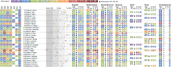
Visualising student performance 2

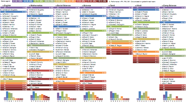
This earlier visualisation was revised based feedback from teachers. It’s split into two parts: one focused on performance by subject, and another on performance of each student.

Students’ performance by subject

Visualisation by subject

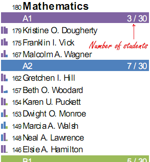
This is fairly simple. Under each subject, we have a list of students, sorted by marks and grouped by grade. The primary use of this is to identify top performers and bottom performers at a glance. It also gives an indication of the grade distribution.

For example, here’s mathematics.

Student scores in a subject

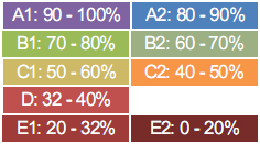
Grades are colour-coded intuitively, like rainbow colours. Violet is high, Red is low.

Colour coding of grades 

The little graphs on the left show the performance in individual exams, and can be used to identify trends. For example, from the graph to the left of Karen’s score:

A single student's score

… you can see that she’d have been an A1 student (the first two bars are coloured A1) but for the dip in the last exam (which is coloured A2).

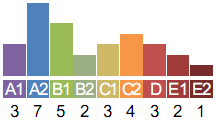
Finally, there’s a histogram showing the grades within the subject.

Histogram of grades

Incidentally, while the names are fictitious, the data is not. This graph shows a bimodal distribution and may indicate cheating.

Students’ performance

Visualisation by student 

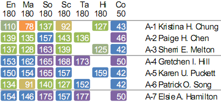
This is useful when you want to take a closer look at a single student. On the left are the total scores across subjects.

Visualisation of total scores

Because of the colour coding, it’s easy to get a visual sense of a performance across subjects. For example, in the first row, Kristina is having some trouble with Mathematics. And on the last row, Elsie is doing quite well.

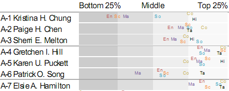
To give a better sense of the performance, the next visualisation plots the relative performance of each student.

Visualisation of relative performance

From this, it’s easy to see that Kristina is the the bottom quarter of the class in English and Science, and isn’t doing to well in Mathematics either. Gretchen and Elsie, on the other hand, are consistently doing well. Patrick may need some help with Mathematics as well. (Incidentally, the colours have no meaning. They just make it overlaps less confusing.)

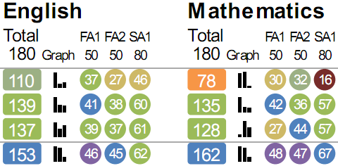
Next to that is the break-up of each subject’s score.

Visualisation of score break-up

The first number in each subject is the total score. The colour indicates the grade. The graph next to it, as before, is the trend in marks across exams. The same scores are shown alongside as numbers inside circles. The colour of the circle is the grade for that exam.

In some ways, this visualisation is less information-dense than the earlier visualisation. But this is intentional. Redundancy can help with speed of interpretation, and a reduced information density is also less intimidating to first-time readers.