Year: 2010

Google search via e-mail

I’ve updated Mixamail to access Google search results via e-mail.

For those new here, Mixamail is an e-mail client for Twitter. It lets you read and update Twitter just using your e-mail (you’ll have to register once via Twitter, though).

Now, you can send an e-mail to twitter@mixamail.com with a subject of “Google” and a body containing your query. You’ll get a reply within a few seconds (~20 seconds on my BlackBerry) with the top 8 search results along with the snippets.

It’s the snippets that contain the useful information, as far as I’m concerned. Just yesterday, I managed to find the show timings for Manmadan Ambu at the Ilford Cine World via a search on Mixamail. (Mixamail win, but the movie was a let down, given expectations.)

You don’t need to be registered to use this. So if you’re ever stuck with just e-mail access, just mail twitter@mixamail.com with a subject “Google”.

PS: The code is on Github.

Visualising student performance

I’ve been helping with visualising student scores for ReportBee, and here’s what we’ve currently come up with.
class-scores

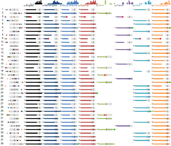
Each row is a student’s performance across subjects. Let’s walk through each element here.

The first column shows their relative performance across different subjects. Each dot is their rank in a subject. The dots are colour coded based on the subject (and you can see the colours on the image at the top: English is black, Mathematics is dark blue, etc.)
class-scores-2

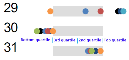
The grey boxes in the middle shows the quartiles. A dot on the left side means that the student is in the bottom quartile. Student 30 is in the bottom quartile in almost every subject. The grey boxes indicate the 2nd and 3rd quartiles. Dots on the right indicate the top quartile.

This view lets teachers quickly explain how a student is performing – either to the headmistress, or parents, or the student. There is a big difference between a consistently good performer, a consistently poor performer, and one that is very good in some subjects, very poor in others. This view lets the teachers identify which type the student falls under.

For example, student 29 is doing very well in a few subjects, OK is some, but is very bad at computer science. This is clearly an intelligent student, so perhaps a different teaching method might help with computer science. Student 30 is doing badly in almost every subject. So the problem is not subject-specific – it is more general (perhaps motivation, home atmosphere, ability, etc.) Student 31 is consistently in the middle, but above average.

class-scores-3

The bars in the middle show a more detailed view, using the students’ marks. The zoomed view above shows the English, Mathematics and Social Science marks for the same 3 students (29, 30, 31). The grey boxes have the same meaning. Anyone to the right of those is in the top quarter. Anyone to the left is in the bottom quarter.

Some of bars have a red or a green circle at the end

class-scores-5

The green circle indicates that the student has a top score in the subject. The red circle indicates that the student has a bottom score in the subject. This lets teachers quickly narrow down to the best and worst performers in each subject.

The bars on top of the subjects show the histogram of students’ performances. It is a useful view to get a sense of the spread of marks.

class-scores-4

For example, English is significantly biased towards the top half than Mathematics or Science. Mathematics has main “trailing” students at the bottom, while English has fewer, and Social Science has many more.

Most of this explanation is intuitive, really. Once explained (and often, even when not explained), they are easy to remember and apply.

So far, this visualisation answers descriptive questions, like:

  • Where does this student stand with respect to the class?
  • Is this student a consistent performer, or does his performance vary a lot?
  • Does this subject have a consistent performance, or does it vary a lot?

We’re now working on drawing insights from this data. For example:

  • Is there a difference between the performance across sections?
  • Do students who perform well in science also do well in mathematics?
  • Can we group students into “types” or clusters based on their performances?

Will share those shortly.

What does India search for?

Over the last couple of years, I’ve been tracking the top 5 hot searches in India on Google Trends (http://www.google.co.in/trends). Here are the results:

If you’re interested in making visualisations out of it, please feel free. But there’s one particular thing I’m trying out, which is to categorise these searches and see if there’s a trend around that. I’ve added a “Tag” column.

Could you please help me tag the spreadsheet: https://spreadsheets.google.com/ccc?key=0Av599tR_jVYgdE5zTU5QWjcxVWVCaTBuY3d0NkUtc1E&hl=en_GB

It’s publicly editable, no special access required. If you could stick to the tags I already have (Business, Education, Entertainment, News, Politics, Sports, Technology), that would be great. If not, that’s fine as well.

And if you’ve made any visualisations or done any analysis using this data, please do drop a comment.

Visualising the Wilson score for ratings

Reddit’s new comment sorting system (charmingly explained by Randall Munroe) uses what’s called a Wilson score confidence interval.

I’ll wait here while you read those articles. If you ever want to implement user-ratings, you need to read them.

The summary is: don’t use average rating. Use something else, which in this case, is the Wilson score, which says that if you got 3 negative ratings and no positive ratings, your average rating shouldn’t be zero. Rather, you can be 95% sure that it’ll end up at 0.47 or above, given a chance, so rate it as 0.47.

I understand this stuff better visually, so I tried to see what the rating would be for various positive and negative scores. Here’s the plot.

The axes on the floor show the number of positive and negative ratings (you can figure out which is which), and the height of the surface is the average rating it should get.

You can see that if there are only positive ratings, the average rating is 100% (because there’s a 95% chance it’ll end up at 100% or above). If there are only negative ratings, the rating falls of sharply. In the early stages, a few positive ratings can correct that very quickly, but over time, the correction’s a lot weaker.

You can move your mouse over the visualisation to control the angle. (For those reading this this via the RSS feed, you may need to visit my blog.) Try it out: I understood the behaviour a lot better this way.

Yahoo Clues API

Yahoo Clues is like Google Insights for Search. It has one interesting thing that the latter doesn’t though: search flows.

It doesn’t have an official API, so I thought I’d document the unofficial one. The API endpoint is

http://clues.yahoo.com/clue

The query parameters are:

  • q1 – the first query string
  • q2 – the second query string
  • ts – the time span. 0 = today, 1 = past 7 days, 2 = past 30 days
  • tz – time zone? Not sure how it works. It’s just set to “0” for me
  • s – the format? No value other than “j” seems to work

So a search for “gmat” for the last 30 days looks like this:

http://clues.yahoo.com/clue?s=j&q1=gmat&q2=&ts=2&tz=0

The response has the all the elements required to render the page, but the search flows are located at:

  • response.data[2].qf.prevMax – an array of queries that often precede the current one
  • response.data[2].qf.nextMax – an array of queries that often follow the current one

The other parameters (such as demographic, geographic and search volume information) is pretty interesting as well, but is something you should be able to extract more reliably from Google Insights for Search.

Automated image enhancement

There are some standard enhancements that I apply to my photos consistently: auto-levels, increase saturation, increase sharpness, etc. I’d also read that Flickr sharpens uploads (at least, the resized ones) so that they look better.

So last week, I took 100 of my photos and created 4 versions of each image:

  1. The base image itself (example)
  2. A sharpened version (example). I used a sharpening factor of 200%
  3. A saturated version (example). I used a saturation factor of 125%
  4. An auto-levelled version (example)

I created a test asking people to compare these. The differences between these are not always noticeable when placed side-by-side, so the test flashed two images at the same place.

After about 800 ratings, here are the results. (Or, see the raw data.)

Sharpening clearly helps. 86% of the sharpened images were marked as better than the base images. Only 2 images (base/sharp, base/sharp) received a consistent feedback that the sharpened images were worse. (I have my doubts about those two as well.) On the whole, it seems fairly clear that sharpening helps.

Saturation and levels were roughly equal, and somewhat unclear. 69% of the saturated images and 68% of auto-levelled images were marked as better than the base images. And almost an equal number of images (52%) showed saturation as being better than the auto-levelled version. For a majority of images (60%), there’s a divided opinion on whether saturation was better than levelling or the other way around.

On the whole, sharpening is a clear win. When in doubt, sharpen images.

For saturation and levelling, there certainly appears to be potential. 2 in 3 images are improved by either of these techniques. But it isn’t entirely obvious which (or both) to apply.

Is there someone out there with some image processing experience to shed light on this?

Surviving in prison

As promised, here are some tips from the trenches on surviving in prison. (For those who don’t follow my blog, prison is where your Internet access is restricted.)

There are two things you need to know better: software and people. I’ll try and cover the software in this post, and the more important topic in the next.

Portable apps

You’re often not in control of your laptops / PCs. You don’t have administrator access. You can’t install software. The solution is to install Portable Apps. Most popular applications have been converted into Portable Apps that you can install on to a USB stick. Just plug them into any machine and use them. I use Firefox and Skype quite extensively this way, but increasingly, I have a preference for Portable Apps for just about everything. It makes my bloated Start Menu a lot more manageable. Some of the other portable apps I have are: Audacity, Camstudio, GIMP, Inkscape and Notepad++.

Admin access

The other possibility is that you try and gain admin access. I did this once at a client site (a large bank). We didn’t have admin access. I wasn’t particularly thrilled. So I borrowed a floppy, installed an offline password recovery tool, rebooted, and got the admin password within a few minutes. This is with the full knowledge of the (somewhat worried) client. This is where the people part comes in, and I’ll talk about that later.

Proxies

But before you do any of these, you need to be able to download the files, most of which are executables. Those are probably blocked. Heck, the sites from which you can download these files are probably blocked in the first place.

Sometimes, internal proxies help. Proxies for different geographies may have different degrees of freedom. When I was at IBM, the Internet was accessible from most US proxies, just not from the Indian proxy. So it may just be a matter of finding the right internal proxy.

Or you can search for external public proxies. Sadly, many of these are blocked. Another option is for you to set up your own proxy. You can install mirrorrr on AppEngine for free, for example.

The most effective option, of course, is to use SSH tunnels. I’ve covered this is some detail earlier.

Google

Google has a wide range of tools that can help access blocked sites. If the site you’re accessing provides public RSS feeds, use Google Reader to access these. Public feeds for Twitter, for example, are available as RSS feeds.

Google’s cache is another way of getting the same information. Search for the URL, click on the “Cache” link to read the text even if it’s blocked.

To find more such help, Google for it!

Peopleware

… but all of this is, honestly, just a small part of it. The key, really, is to understand the people restricting your access. I’ll talk about this next.

Shortening sentences

When writing Mixamail, I wanted tweets automatically shortened to 140 characters – but in the most readable manner.

Some steps are obvious. Removing redundant spaces, for example. And URL shortening. I use bit.ly because it has an API. I’ll switch to Goo.gl, once theirs is out.

I tried a few more strategies:

  1. Replace words with short forms. “u” for “you”, “&” for and, etc.
  2. Remove articles – a, an, the
  3. Remove optional punctuation – comma, semicolon, colon and quotes, in particular
  4. Replace “one” with “1”, “to” or “too” with 2, etc. “Before” becomes “Be4”, for example
  5. Remove spaces after punctuations. So “a, b” becomes “a,b” – the space after the comma is removed
  6. Remove vowels in the middle. nglsh s lgbl wtht vwls.

How did they pan out? I tested out these on the English sentences on the Tanaka Corpus, which has about 150,000 sentences. (No, they’re not typical tweets, but hey…). By just doing these, independently, here is the percentage reduction in the size of text:

2.0% Remove optional punctuations – comma, semicolon, colon and quotes
2.2% Remove spaces after punctuations. So “a, b” becomes “a,b”
3.3% Replace words with short forms. “u” for “you”, “&” for and, etc.
3.3% Replace “one” with “1”, “to” or “too” with 2, etc.
6.7% Remove articles – a, an, the
18.2% Remove vowels in the middle

Touching punctuations doesn’t have much impact. There aren’t that many of them anyway. Word substitution helps, but not too much. I could’ve gone in for a wider base, but the key is the last one: removing vowels in the middle kills a whopping 18%! That’s tough to beat with any strategy. So I decided to just stop there.

The overall reduction, applying all of the above, is about 22%. So there’s a decent chance you can type in a 180-character tweet, and Mixamail.com will still tweet it intelligibly.

I had one such tweet a few days ago. I try and stay well within 140, but this one was just too long.

The Lesson: If you’re writing an app (or building anything), find a use for yourself. There’s no better motivation — and it won’t ever be a wasted effort.

That was 156 characters. It got shortened to:

Lesson If u’re writing app (or building anything) find use 4 yourself. There’s no better motivation — & it won’t ever be wasted ef4t.

Perfectly acceptable.

You may notice that Mixamail didn’t have to employ vowel shortening. It makes the most readable shortenings first, checks if it’s within 140, and tries the next only if required.

If anyone has a simple, readable way of shortening Tweets further, please let me know!

HTML5: Up and Running

HTML5: Up and Running is the book version of Mark Pilgrim’s comprehensive introduction to HTML5 at DiveIntoHTML5.org. Whether you buy the book or read it online, it’s the best introduction to the topic you’ll find.

Mark begins with the history of HTML5 (using email archaeology, as he calls it). You’d never guess that many of the problems we have with XHTML, MIME types, etc. have roots in discussions over 20 years ago. From then on, he moves into feature detection (which uses the Modernizr library), new tags, canvas, video, geo-location, storage, offline web apps, new form features and microdata. Each chapter can be read independently – so if you’re planning to use this as a reference, you may be better of reading the links kept up-to-date at DiveIntoHTML5.org. If you’re interesting in learning about the features, it’s a very readable book, terse, simple, and above all, delightfully intelligent.

Incidentally, if you’re starting off on a new HTML5 project, you’re probably best off using HTML5BoilerPlate.com. It’s very actively maintained, and contains some really nifty tricks you can learn like the protocol-relative URL.

Disclosure: I’m writing this post as part of O’Reilly’s blogger review program. While I’m not getting paid to review books, I sure am getting to read them for free.

Twitter via e-mail

Since I don’t have Internet access on my BlackBerry (because I’m in prison), I’ve had a pretty low incentive to use Twitter. Twitter’s really handy when you’re on the move, and over the last year, there were dozens of occasions where I really wanted to tweet something, but didn’t have anything except my BlackBerry on hand. Since T-Mobile doesn’t support Twitter via SMS, e-mail is my only option, and I haven’t been able to find a decent service that does what I want it to do.

So, obviously, I wrote one this weekend: Mixamail.com.

I’ve kept it as simple as I could. If I send an email to twitter@mixamail.com, it replies with the latest tweets on my Twitter home page. If I mail it again, it replies with new tweets since the last email.

I can update my status by sending a mail with “Update” as the subject. The first line of the body is the status.

I can reply to tweets. The tweets contain a “reply” link that opens a new mail and replies to it.

I can subscribe to tweets. Sending an email with “subscribe” as the subject sends the day’s tweets back to me every day at the same hour that I subscribed. (I’m keeping it down to daily for the moment, but if I use it enough, may expand it to a higher frequency.)

Soon enough, I’ll add re-tweeting and (update: added retweets on 27 Oct) a few other things. I intend keeping this free. Will release the source as well once I document it. The source code is at Github.

Give it a spin: Mixamail.com. Let me know how it goes!


For the technically minded, here are a few more details. I spent last night scouting for a small, nice, domain name using nxdom. I bought it using Google Apps for $10. The application itself is written in Python and hosted on AppEngine. I use the Twitter API via OAuth and store the user state via Lilcookies. The HTML is based on html5boilerplate, and has no images.