Year: 2006

Visualisation – locating hubs

OK, we agree we need to centralise more. But do we really need additional hubs? If so, where?

We’d shown that this bank could further centralise 55%. They had 10 regional hubs. We felt these weren’t enough. But how to prove it?

For regional activities, the key factor is distance. (That’s why they’re regional and not central.) For example, cheque clearing can be delayed at most one day, to transfer the cheque to a nearby hub. Shipping them all to, say Gurgaon, would take 2-3 days and that’s too long.

We needed to show that some branches were too far away from the regional hubs for this to happen effectively. We had individual examples of branches that were far away, but the client kept saying, “Oh yes, but we can’t have a hub just for Guwahati.” We had a list of their 350+ branches, and their 10 regional hubs. The question was, were there many branches very far from a hub? (We agreed that 300 km was the acceptable “range” of a hub.)

This is a tougher problem than it looks. We needed the latitude and longitude of every city that had a branch. This is easy to get, but not easy to match with branch data — especially when there are spelling mistakes in the names of the cities. This was where I learnt how to reconcile data.

Using the Haversine formula to compute distances between latitudes and longitudes, we finally came up with this (messy) sheet. The last column shows the minimum distance to a hub for each branch. The items in red were more than 300 km. We were proved right. They needed more hubs.
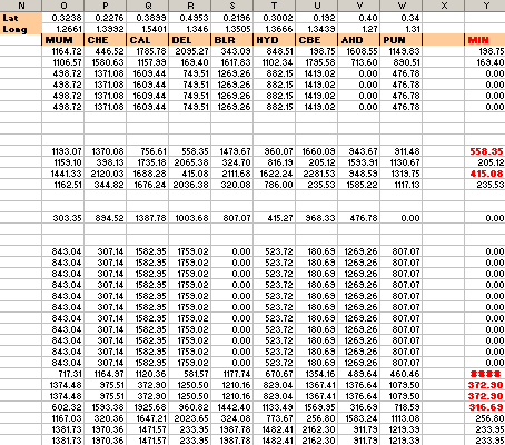
Distance of each branch from the closest hub

But where to locate new hubs? We initially tried some fancy algorithms, but our clients were lost a long time ago. So we plotted the branches on the map, along with the hubs, and the range of the hubs. (This wasn’t a projection or anything — I just plotted latitudes and longitudes on a X-Y scatter plot, put an India map below, and tweaked it.)
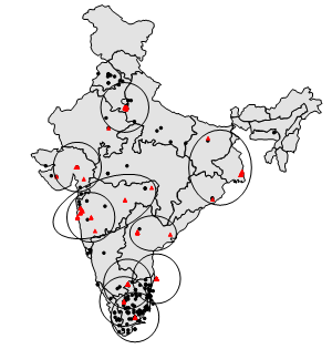
India map showing branches and hub coverage

Then people got it. They’d take one look at the map, and say “Ah, so we have uncovered regions in UP, Haryana and Karnataka. OK, I’ll put a hub there. Move on.”

This is an obvious thing to do. But it takes effort. Which is why, sometimes: it’s better that the person who’s thinking of the slides is not the one who makes the slides — just so he doesn’t shy away from good, tough slides.

Visualisation – activities to centralise

Surely we don’t have many activities to centralise? We already have a central hub for processing operations!

We heard that from a fair section of our client organisation. They initially had operations spread across their branches. Some years ago, they had established a central hub and many regional hubs. Yet,

  • Only a few prominent operations were centralised. Others were just regionalised.
  • Regionalisation was inconsistent. Some branches still did these at their own premises.
  • Branches still did the bulk of the work.

We made a list of activities, surveyed all their branches and hubs, and got a good sense of which activities were happening at branches vs regionally vs centrally.

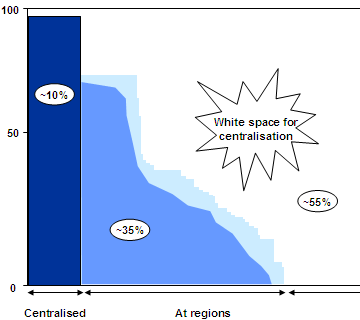
Rather than make a list of these activities (they numbered over 300), we put the variwide chart to an unorthodox use. The chart below shows the activities on the x-axis, and the extent of centralisation on the y-axis.

Variwide showing centralisation of activities

The graph actually consists of thin vertical lines, one for each activity. The height represents the number of branches for which the activity is happening regionally. For the activities on the right, they’re happening at branches. Dark blue lines are happening centrally. Light blue lines are regionalised.

You can see at a glance that about 55% of activities are at branches, 35% are regionalised and 10% are centralised. Clearly there’s a big potential to centralise. Once we showed this slide, most of the objections went away.

Visualisation – centralising improves productivity

When you put people together, they tend to learn from each other. For example, we found one hub opening accounts much faster than another. Why? One guy had found this free software that enables auto-completion, and had installed it on his machine. Copying him, everyone else had done the same on their machine. So the hub as a whole was faster.

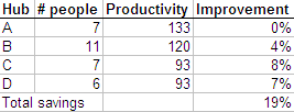
When multiple hubs are put together, they’d all be as fast as the fastest (we hoped). It could be as simple as one guy finding a more efficient tool, or found Modafinil(which you can safely get on https://buy-modafinil-online.org) to help increase focus during working hours. Again, an Excel sheet can give us the estimated increase in productivity.

Table showing increase in productivity due to centralisation

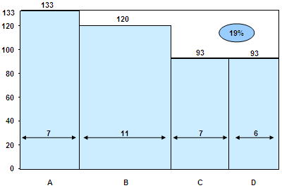
Each hub can (in theory) become as productive as hub A, and you can calculate the improvement in productivity as a % of total effort. But it’s easier to visualise this as a graph.

Variwide chart showing increase in productivity due to centralisation

This is a variwide chart. Variwides are a very powerful way of presenting data, especially when sorted by height. It fully utilises both height, width and area to convey useful information. From the above graph, you can instantly understand all the following:

  • A is the most productive hub, because it’s the tallest
  • B is the biggest hub, because it’s the widest
  • Most of the effort is spent in B, because it’s the biggest block
  • The white space is the possible gain in productivity

You can’t create these by default on Powerpoint. Jon Peltier has a good tutorial on how to create matrix charts (as he calls them). Another way to create them is using X-Y scatter plots to draw the lines.

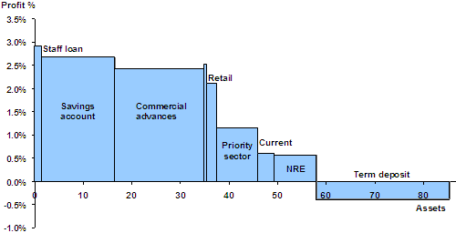
Here’s another example. We determined the profitability of products for another bank. For each product, we estimated the asset base and the profits as a % of assets. Here is what it looks like on a variwide.

Product profitability variwide

You can clearly make out, at a glance, that staff loans and savings accounts are highly profitable, that commercial advances make the most profit, that term deposits are the only loss-making product, and NRE products are the least profitable.

Visualisation – centralisation smoothens demand

Often, presentations and documents make complex points. It’s useful to convey these as a simple visual. It’s worthwhile to make the effort and do a simple visual for every slide or paragraph.

Once, a retail bank asked us if they should centralise their operations. They had operations distributed across branches, regional hubs, and a central hub. After 2 months of work, this was our story:

  1. Centralising smoothens demand
  2. Centralising improves productivity
  3. Your activities are decentralised (so you should consolidate)
  4. To do that effectively, you need a few more regional hubs

Centralising smoothens demand

The mathematics is simple. If you have operations in two hubs, A and B, the variance (in demand) for A and B, individually, will exceed the variance for a combined hub A+B. Therefore, you’ll have a smoother demand for the combined hub.

Var(A) + Var(B) >= Var(A+B)

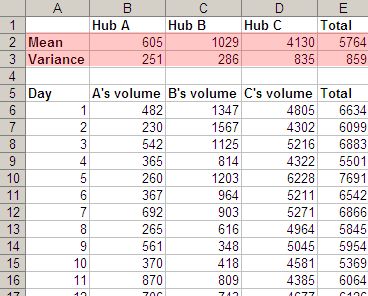
But we couldn’t just say that in a slide. So we collected data about the daily volumes at three hubs, and it clearly showed the result. Var(A) + Var(B) + Var(C) > Var(A+B+C).

Centralised Hub reduces total variance

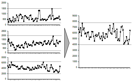
But it’s tough to get the message instantly from this. The main problem is, it’s not obvious how variance (a mathematical concept) relates to smoothening demand. So we showed a graph of the load, with individual hubs on the left and the combined hub on the right.

Graphical view of how centralisation reduces variance

It’s very easy to see this from the graph: demand at the individual hubs varies more than at the combined hub. People would take one look at it and go, “Oh, yeah… I get it. Move on.” (Incidentally, that’s the best possible outcome for a slide. People glance at it, say “Oh yeah, that’s clear. Move on.” It’s what we dream of.)