This week, I learned:
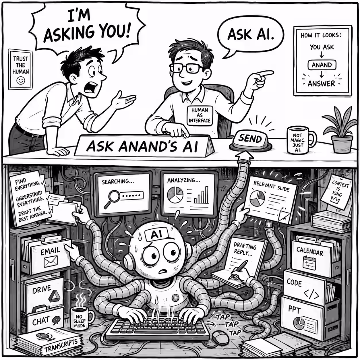
Writing is slightly, but only slightly, better than typing (for adult learning.) One factor is that typing is faster, so many people take notes verbatim, summarizing and thinking less. ChatGPT + Claude Graphology for personality is pseudoscience. ChatGPT + Claude When I decide to spend time, or someone says “Let’s do X”, it’s worth checking: is this something AI can easily try, and is it clear to verify? If so, reinforcement learning loops could make AI good at it, making it a depreciating asset. Studying how to live in an AI world is exhausting. (Not as bad as my MBA days, but not as easy as my data scientist days, either.) It requires me to make a larger mental shift, i.e. change my perspective, than I have since 2000, and that feels like work. Both nl FILE and cat -n FILE add line numbers to files, but nl skips blank lines by default, cat doesn’t. After using rtk for 2 months, I’m slightly downgrading it. It saves tokens but agents mess up shell commands when using it. It’s still probably a net saving, so I’ve changed my AGENTS.md from “Always prefix with rtk” to “Prefix supported, high-output commands with rtk… skip for bash builtins, pipes, loops, etc.” I find 🔴🟡🟢 convenient status indicators in my notes. Similar ones are: 🟥🟨🟩, ❤️💛💚, 📕📙📗. I’m not fully convinced by: 😄😐😞, █ ▒ ░, ↑ → ↓, ▁▂▃▄▅▆▇, ■ ⬔ □, ● ◐ ○, ⚫ ⚪ 🔘, 🌕 🌗 🌑, etc. though they might have their uses. Model updates means a SKILL.md and a plugin review / update, e.g. with GPT 5.6 Sol. So, like with any open source repo, use from people who update it regularly and benchmark it and version control it by model. I asked Gemini 3.5 Flash thinking: “Which of our employees have worked on Microsoft PowerApps? Search @Google Drive and @Gmail”. It found one employee and a referral in under a minute. I asked ChatGPT with GPT 5.6 Sol with gws access. It found 3 more, plus 5 possibilities, in 12 minutes. Truly a rottweiler. Parallel Search Turbo seems like a pretty good search API, especially for agents. Low price, high speed, and maybe good quality. #ForNow ChatGPT Group chats in ChatGPT will probably get deprecated #ForNow. What I learned from benchmarking my Ideation Protocol skill extensively: Once you know the rubric, models can easily create a good prompt to optimize for a known rubric #ForNow. So rubric design matters more. ⭐ Rubric design is really knowing what you want/need. To do this, iterating on output matters. Position bias is real #ForNow. Always check if an (P, Q) comparison matches a (Q, P) comparison. Models are still biased towards longer content, and potentially towards their own output #ForNow. How to optimize a prompt or skill: Research and figure out what you really want, first. Then, ask a smart model for a prompt that optimizes for it. Benchmark only if you’ll use it a lot - it’s still a lot of work, and meta-prompting does a good job #ForNow. gbrain skillopt might be premature optimization. You can use GPT 5.6 Sol in Claude Code #ForNow. (But what’s the point? Harnesses seem to be working better with their own models #ForNow.) Our clients keep saying “We need to build a data lake” or “We need an enterprise data strategy.” I keep telling them, “No, agents can do it for you.” What I missed is: technology is the smaller part of the problem. Finding who has what data, getting access to it, and sorting out permissions (“governance”) is the bigger part. Giving agents expert task-specific, testable procedures seems better than expert roles or mental models #ForNow. But benchmark in any case. ChatGPT Python 3.3 introduced str.casefold(). It performs more comprehensive Unicode caseless matching than lower(); 'Straẞe'.casefold() becomes 'strasse'. (🟢 Unicode case-folding is standardized.) contextlib.closing(x) calls x.close() when its context exits. (⚪) In a dataclass, use x: list = dataclasses.field(default_factory=list), not a mutable literal default. (⚪) I learnt these while reviewing Codex-generated Python—illustrating, rather than proving, that reviewing AI-generated code can teach and catch errors. (🟡 Review remains useful across tooling. Review 2029.) “Do not discriminate against intelligence—artificial or otherwise” is a rhetorical value judgment, not an empirical conclusion. (⚫ Rhetorical value judgment, not testable. Review now.) Here’s a nice idea from ChatGPT. “When itching to correct or clarify, FIRST restate their position to their satisfaction. ‘Did I get you right, fully?’” This emerged from the prompt suffix: Based on your research, and my past conversations, what are the top areas where and how (specifically) I can apply this principle on myself and others to maximize impact? Automated evals can catch stuff humans miss. And vice versa. And given how many evals we create, we need automated evals to be written in an easy-to-review way. Do Automated Evals Work? The BINEVAL paper reiterates that a bunch of Yes/No binary questions beats scales or ratings for many benchmarks. You know exactly how to grade and WHY you got a certain score. This is more reproducible and easier to learn from / act on. When asked “How long will this software take?” models typically provide estimates assuming human speed #ForNow. Maybe they haven’t been trained enough on agentic timelines. So, when my colleague got a 2-4 week estimate which he was able to solve in hours, it was a surprise. (But, of course, it’s best to verify before promising speed.) SKILL.md dramatically lowers the cost of learning a skill (since you don’t learn it - the agent does). That means that the value of creating skills is much higher - hundreds can use what you create (giving you recognition, if not money). I think I’ve underestimated the number of skills people will have available (I thought dozens - but it may be thousands #ForNow) and the number of skills people will create (I thought tens of thousands - but it may be millions #ForNow.) A Wikipedia (community curated, verified, high quality catalog) of skills might emerge #ForNow, if it hasn’t already. Tacit knowledge is often just un-measured knowledge. Once I put a sensor on the bellboy’s hands at The Curzon Court, AI can figure out how he opens the door with the key and why I can’t do the same. The subset of tacit knowledge that’s AI-resistant is where attempts are expensive (“How to negotiate a merger” rather than “How to open a door”) and feedback is slow/vague (“Does the client trust me” rather than “Did the door open”). The fact that Composio has ~20,000 tools is a market signal that connectors are commoditizing, and are a depreciating asset #ForNow. A weak model needs a forgiving harness - which ends up slowing down model learning. Stricter, accurate verification environments are better for fastest model learning. ChatGPT Work lets you run for longer, faster, install plugins and skills, host a website, etc #ForNow. It’s somewhere between Chat and Codex. It consumes Codex limits - something to watch for (since chat limits are quite generous). Codex temporarily removed the 5-hour usage limit. Tibo. So, since I have 3 banked rate-limit resets #ForNow, I can, in theory, use 4 full weeks of Codex usage at one go. Reality: I don’t have problems large enough for a SINGLE week’s consumption! From what I see of the State of AI Design and State of Prototyping, Figma is way ahead of competition #ForNow, e.g. Adobe, with Figma Make and Weave. I was also surprised how popular Cursor is (#2 behind Claude Code #ForNow). It’s also interesting that designers are coding directly #ForNow, using Figma just for edits / steering. But many research tools (note takers, survey analysis/research, etc.) will likely get eaten up by AI coding agents #ForNow, given how much designers are building their own tools.